
How Typography Choices Shape the Perception of Your Brand.
When you think about branding, fonts might not be the first thing that comes to mind. Colours often steal the spotlight, logos feel like the obvious hero—but my favourite, typography, is the one quietly working in the background, shaping how people feel about your brand.
Your fonts are doing more than spelling out words (and hopefully looking beautiful at the same time). They’re carrying tone, personality, and energy. The right typography can instantly communicate whether your brand feels approachable, refined, playful, professional, or soulful. The wrong fonts? They can stir big reactions, create confusion, inconsistency, and even a lack of trust.
If you feel overwhelmed when it comes to choosing fonts, please know you’re not alone. Maybe you’re thinking: “How do I know what looks good together? Do I need ten? Should I just pick what I like?” I hear this all the time—and that’s exactly why we’re diving into how typography shapes brand perception, and how to make font choices with confidence. Let’s do it!
Why typography matters in branding.
Typography isn’t just design fluff—it’s psychology. Fonts hold subtle cues that influence how your audience interprets your business, often without them realising. Think of it as your brand’s tone of voice in visual form.
First impressions: Fonts set the mood instantly. A bold sans serif feels confident. A delicate serif feels elegant. A handwritten script feels personal.
Brand personality: Just like colours, fonts are shorthand for how your brand shows up in the world. They can say “professional,” “luxury,” “creative,” or “fun.”
Consistency: Using the same fonts across your website, socials, and marketing materials creates recognition and trust (and is a no-brainer!).
Accessibility: The right fonts aren’t just beautiful—they’re legible and functional across different devices and contexts.
Typography can actually shape whether someone feels safe to trust you, inspired to connect with you, or curious to learn more.
The psychology of fonts: What different styles communicate.
Let’s break down the most common font families and the energy they carry:
Serif Fonts
These are the ones with the little “feet” at the ends of letters. They’ve been around for centuries, often used in books and traditional print.
Perception: Timeless, trustworthy, classic, refined.
Best for: Brands that want to convey heritage, expertise, or authority (think law firms, luxury interiors, high-end lifestyle brands).
Sans Serif Fonts
Clean, modern, and minimal—sans serifs skip the decorative strokes and feel sleek and fresh.
Perception: Modern, straightforward, approachable, versatile.
Best for: Brands that want clarity, simplicity, or a contemporary edge (think wellness brands, creatives, or tech).
Script Fonts
Flowing, cursive styles that feel handwritten and expressive.
Perception: Personal, creative, elegant, emotional.
Best for: Brands that want to feel artistic, soulful, or intimate (great for weddings, coaches, holistic practitioners).
Display Fonts
Unique, stylised fonts that are used sparingly—often in logos or headlines.
Perception: Bold, distinctive, memorable.
Best for: Brands wanting to stand out with personality and impact.


L-R: Instagram template & brand design for Michelle Taylor (The Future Self Club) | Serif vs Sans Serif | Brand Identity Design for EP Interior Design Studio. All designed by Indeko Creative.
How many fonts do you really need?
Here’s where it gets simple: you don’t need a library of fonts to look professional. In fact, too many can create chaos.
Primary Font: Your main brand font, used for titles, headings and/or your logo.
Secondary Font: A complementary font for sub-headings and body copy.
Accent Font (optional): For small moments of personality—like quotes, callouts, or subheadings. I love using accent fonts to inject a little somethin’ to a brand.
Most brands thrive with 2–3 fonts max. The key is creating (and maintaining) a hierarchy—a system that shows people what’s important, without making them think too hard.
The subtleties of font weight and style.
It’s not just the font family you choose that shapes perception—it’s also the way you use it. Weight (bold, regular, light) and style (italic, regular) can have a huge influence on hierarchy and energy.
Font Weights
Bold: Strong, confident, attention-grabbing. Perfect for headlines or emphasis. But overusing bold can feel heavy or overwhelming—like someone shouting at you (and no one wants that!). Use it sparingly, and with intention to highlight only what matters most.
Regular: Regular weight is balanced, approachable, and easy to read. This one is designed to be the workhorse of your typography system and should be used for most body copy.
Light/Thin: Elegant, airy, and refined. Works beautifully for high-end or minimalist brands—but can be hard to read at small sizes, so best for larger text or accents. I actually love using light fonts (in fact, you’re reading one right now!), as they tread softly and bring a calmness to words that works for my brand and those I design.
Regular vs Italic
Regular: Neutral, consistent, and stable—this one should be the foundation of your text.
Italic: Great for adding nuance, personality, or emphasis. It can feel softer, more conversational, or even poetic. Best used sparingly for quotes, highlights, or subtle shifts in tone.
Just like font size, weight, and style create hierarchy (which is a must for any brand). They guide the eye, show what’s important, and create a rhythm that feels intentional and refined. The balance comes in knowing when to emphasise and when to hold back. Too much bold or italic, and your brand will feel cluttered, messy, loud, or all three. But used thoughtfully, they bring contrast, sophistication, balance and flow.


L-R: Brand Identity Design for Taylored Design Studio | ‘Take the Pause’ quote in regular (top) and light (bottom) font weights | Our Instagram Post template. All designed by Indeko Creative.
Practical tips for choosing brand fonts.
If you’re a bit sick of staring at endless font options, here’s how to narrow it down:
Start with your brand personality. Is your brand elegant and refined, or bold and playful? Choose fonts that match this energy. (And if you’re not sure what your brand personality is, you can take my Brand Archetype Quiz to discover yours—it’s a fun way to guide your design choices.)
Think about your audience. What will resonate with them? A luxury audience will expect something different from a youthful creative audience.
Prioritise legibility. Fancy fonts are fun, but if people can’t read your website or social posts easily, you’ve lost them.
Pair fonts with contrast. A serif heading with a sans serif body font creates balance. Avoid pairing fonts that look too similar—it can feel muddy and unclear.
Test in real life. Don’t just pick a font in Canva. Apply it to a social tile, a web header, or an email heading. Put it to work and see how it feels in action first—fonts really can look totally different depending on their application.
What fonts say without words (it’s all in the energy).
Typography is energy made visible. Even before someone reads your words, the font styling is telling them a story:
Clean sans serif in all caps = modern, confident, bold.
Soft serif in lowercase = gentle, approachable, timeless.
Playful script with curves = creative, expressive, fun.
Your fonts are like body language—they communicate whether your brand is relaxed, serious, trustworthy, or exciting.
Common mistakes to avoid (please, avoid!).
When it comes to choosing fonts, here are a few mistakes I often see, and would love, love, love you to avoid:
Too many fonts. Stick with two or three to keep things clean.
Ignoring hierarchy. Without a clear system, everything looks the same—and nothing stands out.
Overusing trendy fonts. What’s “in” now might date quickly. Choose timeless over trendy.
Forgetting mobile. Fonts that look stunning on desktop can be unreadable on a phone. Always check responsiveness.
Not only are these mistakes a designer’s nightmare, but they are a sure way to lose potential clients before you even have a chance to speak to them.
Bringing typography into your brand system.
The magic of typography comes alive when it’s applied consistently well. Here’s where to use your fonts with intention:
Your logo and submarks
Website headings, body copy, and buttons
Social media templates
Client documents and guides
Email newsletters
Business cards and print materials
When all these touchpoints use the same font system, your brand will feel aligned and recognisable—without needing to plaster your logo everywhere (you shouldn’t need to do that if your brand has been strategically and intentionally designed).
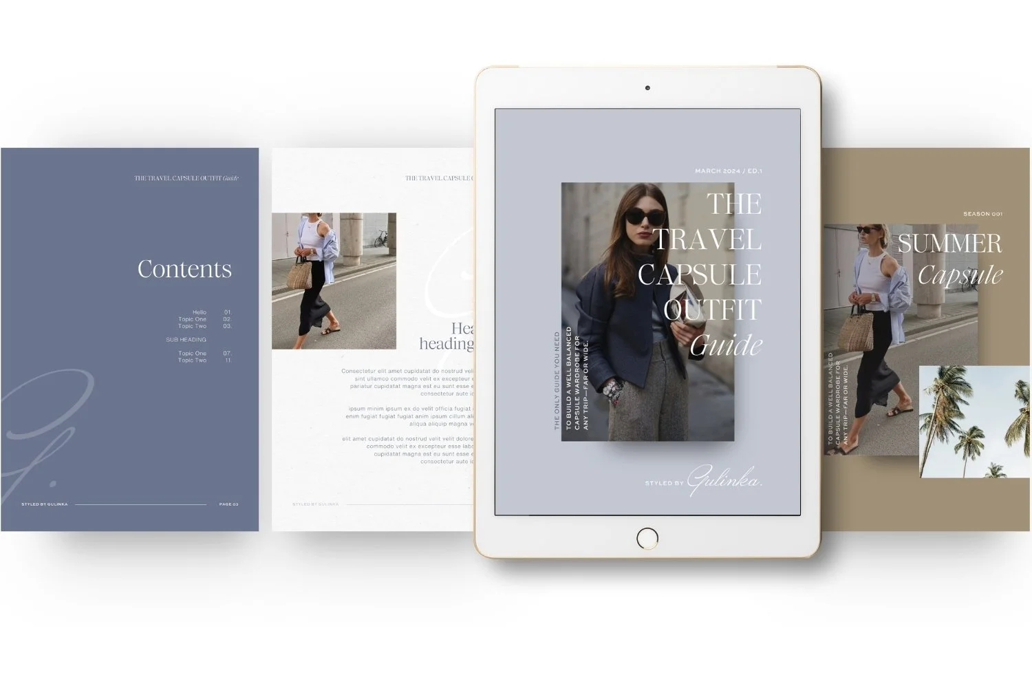

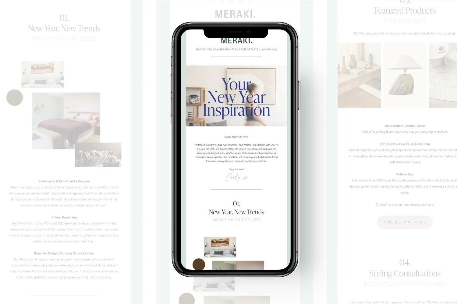
L-R: Resource Guide templates for Styled by Gulinka | Business Card design for EK Holistic Living | Flodesk Email templates for Meraki Home Design. All designed by Indeko Creative.
The final word: Use typography to amplify your brand’s tone of voice.
Fonts are truly one of the most powerful ways to shape how people experience your brand. The right typography makes your brand feel polished, intentional, and aligned. The wrong fonts can make your business feel inconsistent, unprofessional, or confusing.
If you’ve ever felt stuck in the font overwhelm—unsure what goes together or how to make it look cohesive—you’re not alone. This is where having a simple brand font system takes away the stress and brings everything back into flow.
If fonts feel overwhelming and you’re not sure where to start, I’ve got some links and resources below that might help. And, you can always reach out to have a chat if fonts, branding or websites are on your do-list. Get in touch via our Contact page.
K xo
/ Grab my free Aligned Brand Checklist to help you spot what’s working (and what’s not) in your current visuals. Download it here and start bringing everything back into alignment.