
How to Use Your Brand Colours Across Your Logo, Website & Social Media.
Your brand colours are more than just a pretty palette—they carry meaning, evoke emotion, and create the visual consistency that helps your audience recognise and trust your business. But once you have your brand colours, you might find yourself asking: how do I actually use them?
In this article, we’ll explore how to use your brand colours intentionally across your logo, website, and social media. With practical tips and soulful strategy, you’ll walk away with clarity and confidence to bring your brand visuals to life in an aligned and cohesive way.
How Your Brand Colour Palette is Used.
Understanding the role of colour in your brand visuals.
When you approve the brand colour palette that your designer has developed for you, you're not just choosing colours you both like — you're agreeing to the aesthetic direction for every visual expression of your brand. This palette becomes a key part of your visual language and sets the tone for all design elements that follow: your logo, icons, social media templates, website, marketing materials, and more.
In a little metaphor form: It’s the thread that weaves visual cohesion and brand recognition across all touchpoints ☺️
Here’s how I approach colour in your brand identity:
Primary Colours: These are your go-to hues — the ones we’ll use most often across backgrounds, layouts, and larger design elements. They form the foundation of your brand’s visual presence and help establish consistency and recognition.
Secondary Colours: These add personality and depth. Used more sparingly, they will show up in things like headings, brand marks, buttons, icons, or accent graphics. They complement the primary palette and add expression without overwhelming the design.
Accent Colours: These are used intentionally to highlight or call attention — perfect for CTAs, important links, or small design features that need to stand out. Think of these as the visual “spark” in your palette.
Imagery and Visual Direction: Your palette also guides the selection of photography or imagery, ensuring colours within images support and enhance your overall brand vibe. This creates a more cohesive and harmonious look across your website and socials.
Logo Variations: Your logo will be provided in multiple colour options so it remains flexible across different applications. For example, you might use a darker version on light backgrounds, and a lighter version on dark or image-heavy backgrounds — always ensuring contrast, legibility and clarity.
Creative Highlights: Sometimes, a little detail (like a pop of an accent colour in your logo) can bring an unexpected delight. These thoughtful touches are part of how I infuse creativity and individuality into your brand. (I did this recently for a client, and it’s working really well!)
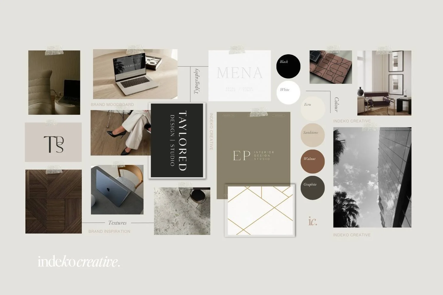
When I work on branding projects with clients, I love to create mood boards like this to express the direction for the creation of their visual brand.
Why Brand Colour Consistency Matters.
Using your brand colours consistently helps your audience:
Instantly recognise your business
Feel a sense of familiarity and trust
Understand your vibe, personality, and values
From a strategic perspective, consistent colour use supports brand recognition, strengthens emotional connection, and makes your overall presence feel polished and intentional.
Using Brand Colours in Your Logo.
1. Keep it simple and memorable.
Your logo should primarily use 1–2 of your primary brand colours. This keeps it clean, versatile, and easy to reproduce across formats.
2. Yes, you need a few different logo variations.
Your branding suite should include a few different variations of your logo in various colours. You’ll need light, dark, and neutral versions to work across different backgrounds and contexts. I like to include portrait and landscape logo versions, plus a monogram and brand mark for my clients, in all colourways so they always have an option that will work, no matter the application.
3. Use colour to reflect your brand personality.
Make sure your logo colours align with how you want your brand to feel. A high-end brand may lean toward deep, muted tones, while a playful brand might opt for bright and saturated hues. Colour is powerful, and it is felt before it is even seen. It says so much without even speaking a word.
Using Brand Colours on Your Website.
Your website is where your colour palette can really come to life. Here's how to apply it with intention:
1. Stick to your palette.
Avoid bringing in extra colours that aren't in your brand kit—this dilutes your visual identity (and will drive your brand designer mad!). Choose consistent colours for:
Headings and text
Background sections
Buttons and calls to action
Links and hover states
2. Use colour hierarchy strategically.
Use your primary colours for backgrounds and large areas. Lighter colours are great for this, and darker hues can provide a big visual impact if you want to attract attention. Reserve secondary colours for supporting elements like buttons, headings, or highlights. Avoid overusing your accent colour—this helps keep your site feeling balanced and clear.
3. Ensure accessibility and readability.
Make sure there’s enough contrast between your text and background colours. Beautiful design should always be easy to navigate and read.
4. Bring in energy with background sections.
Try colour-blocking different website sections using your palette. This creates flow, rhythm, and visual interest without overwhelming the viewer.
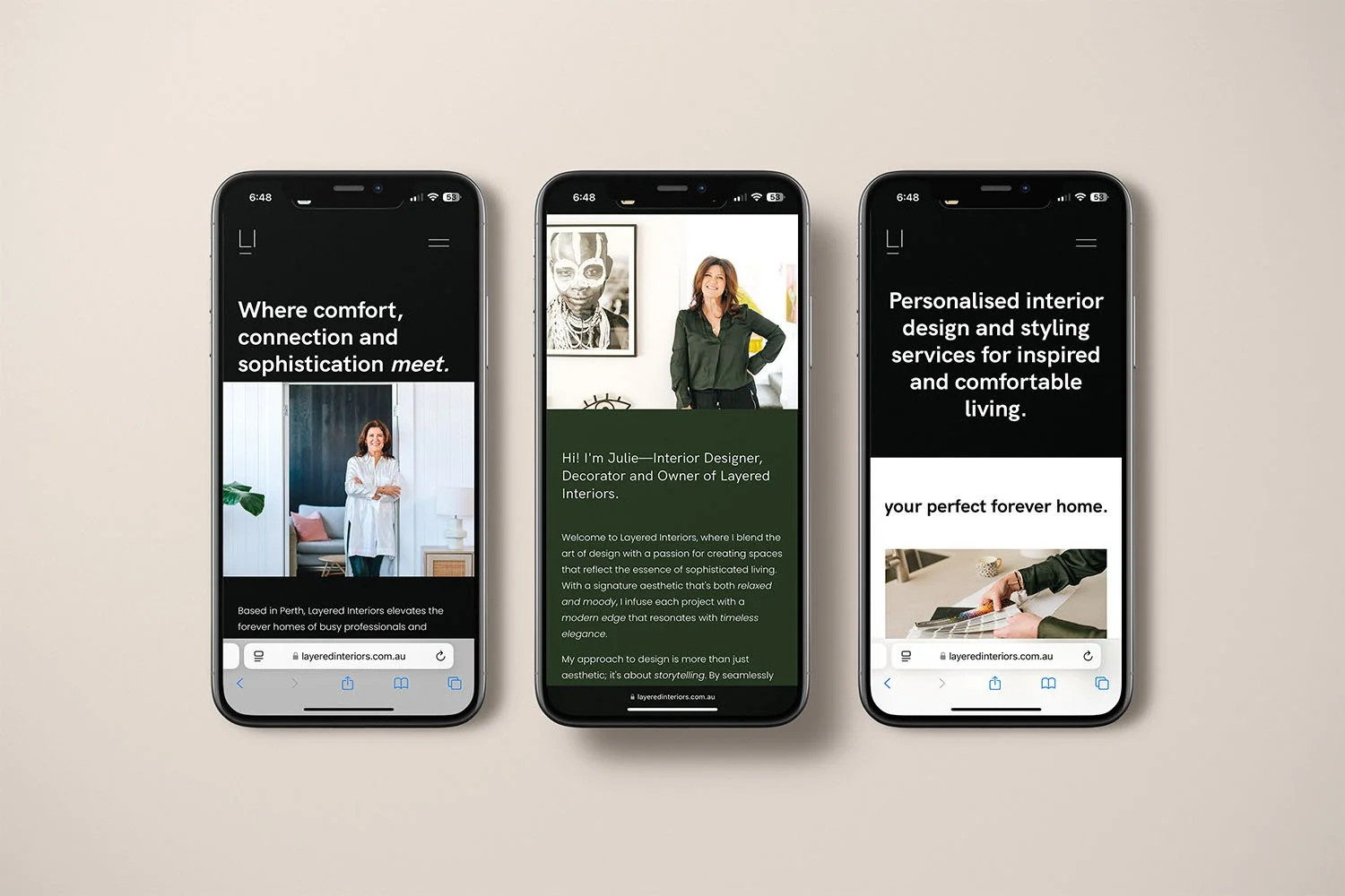
Client Website Design / Layered Interiors, Perth WA.
Colour is a big part of their brand identity and was used strategically throughout the website for visual impact.
Using Brand Colours on Social Media.
Your Instagram feed, stories, Pinterest graphics, and even Reel covers should all feel cohesive and recognisable. Here’s how:
1. Create Canva templates using your colours.
Start with a set of templates designed in your brand colours. This ensures consistency in every post while giving you flexibility in content.
2. Use colours to guide your content categories.
Assign certain colours to specific types of posts (e.g., tips, quotes, promotions). This adds a layer of visual structure that helps your audience engage more easily.
3. Customise highlights and covers.
Your Instagram highlight covers are a perfect place to use brand colours and icons to make your profile feel more polished. I also like to add a branded monogram to these to reinforce brand recognition and awareness.
4. Incorporate subtle brand elements in Reels and Stories.
Even in more spontaneous content, you can still use consistent colours for text overlays, backgrounds, or frames. It all adds up! Use your colours, your brand marks or monograms to increase brand awareness and start sinking in to your viewe’s subconscious. Plus, when you use your colours consistently, people will start recognising your content by the colour alone—true dinks!
Brand Colour Application: A Gentle Reminder.
Using your brand colours isn’t about perfection or rigidity. It’s about creating visual harmony that reflects your soul-led business. Think of your palette as your creative toolkit—one that helps you show up clearly, confidently, and consistently.
As your business grows, your colours become a silent language your audience learns to recognise and trust. They’re part of your brand’s energy field.
___
Your brand colours are powerful allies. When used intentionally, they create a strong sense of presence, harmony, and recognition across every touchpoint of your business.
Whether designing your website, creating social posts, or printing postcards, leaning into your colour palette helps you build a visual identity that truly reflects your essence.
Feeling unsure how to bring your colours to life?
Feel free to book a no-strings chat with me here, or get in touch via our Contact form. I’d love to help you xo